UX Audit: Probo
17 October 2024


Why I Did This UX Audit
Back in college, my friends and I would spend hours debating which cricket team would win the next match or whether the latest startup would succeed. These passionate debates usually ended with someone saying, "Want to bet?" but we never actually did. Later, when I discovered Probo, it reminded me of those animated discussions, except now there was a platform to put real skin in the game.
As Indian users become more accustomed to betting apps like Dream11 and RummyCircle, I found it fascinating that opinion trading is still a relatively new concept here, offering a fresh and intriguing space to explore.
This curiosity led me to dive deep into how Probo's user experience enables or hinders these opinion-based trades for the untapped market in India.
Let's start with the onboarding, while on the official website of probo they have mentioned it strictly that this is only for people above 18 years. But when onboarding there was no mention of asking me regarding my age.

Onboarding was as smooth as hot knife in the butter slab, no friction to drop off on the onboarding.

The app asks if you’d like a guided tour during onboarding, but then leaves you to fend for yourself. This was a lost opportunity to help users feel at home, especially since opinion trading is still a novel concept for many in India. I made sure it wasn't just a bug with me so I onboarded from my friend's phone too but still it was missing.

Imagine walking into a bookstore and not knowing where the new arrivals are. You’d probably miss that book you’ve been waiting to read.
For example, the stationary banners. Users shouldn’t have to swipe just to see what’s new. An auto-sliding carousel could help. (Like zomato has for the food images)
Rewards are referrals
Placement of the search bar should've been at the top making it more accessible and discoverable, there is a reason these days apps having search bars at the top.
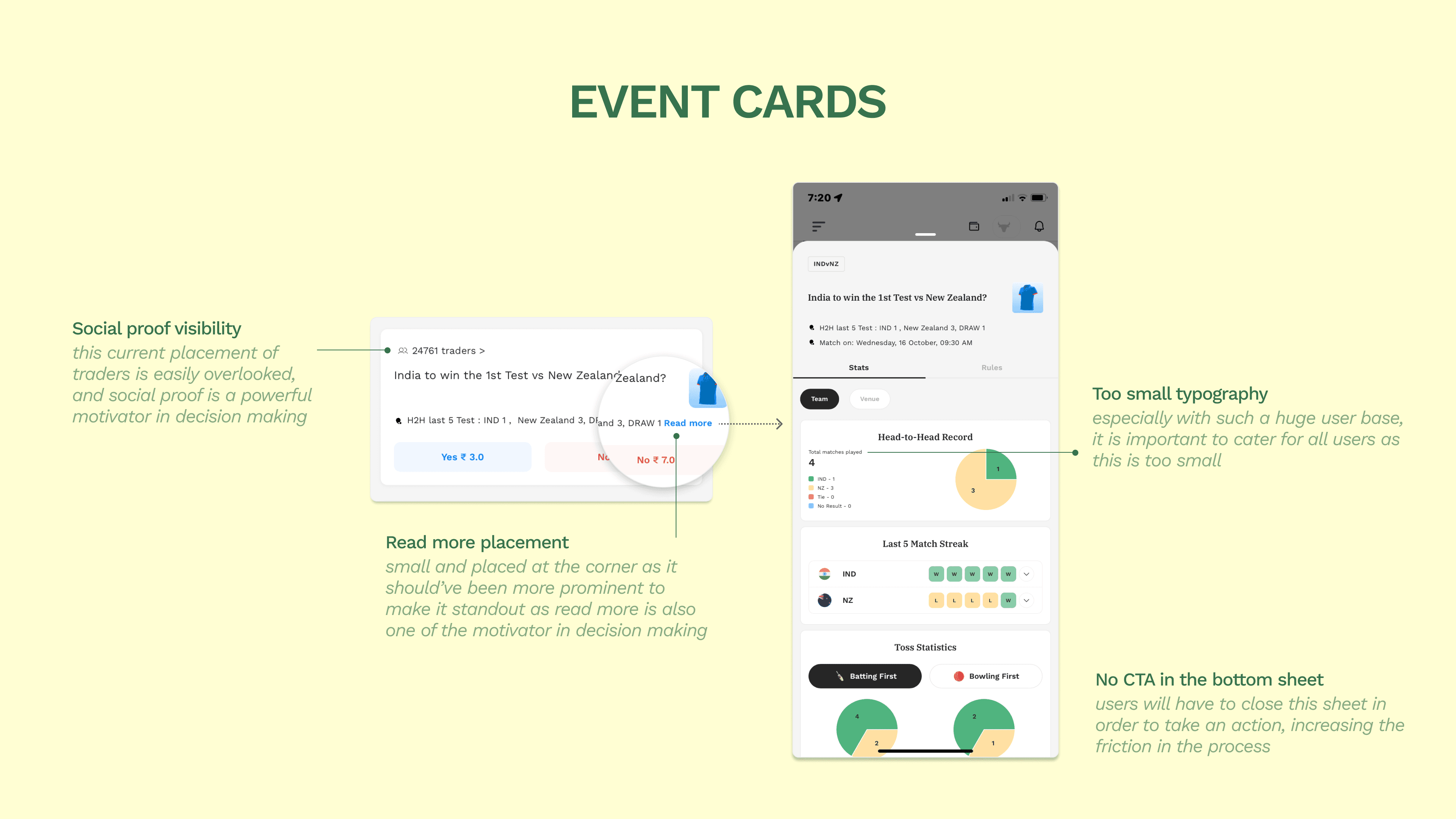
I’ve been in similar situations during group projects at university; if the most important points were buried in the corner of a slide, no one would notice them. Visibility is key, especially when decisions depend on it.
Possible solution could be to Increase the prominence of the 'Read more' button and place clear CTAs in the bottom sheet, reducing friction and encouraging users to take action immediately.

It's like reading an academic research paper and seeing some references hyperlinked while others aren’t disrupting the flow of information. Consistency is key in building user trust especially for indian personas

I was pleasantly surprised to find that Probo keeps users within the app when they click on an embedded video. However, once the video ended, I noticed I could easily get lost in the related content and forget about the original task. Simple nudges or reminders could help bring users back to where they were, keeping them on track.
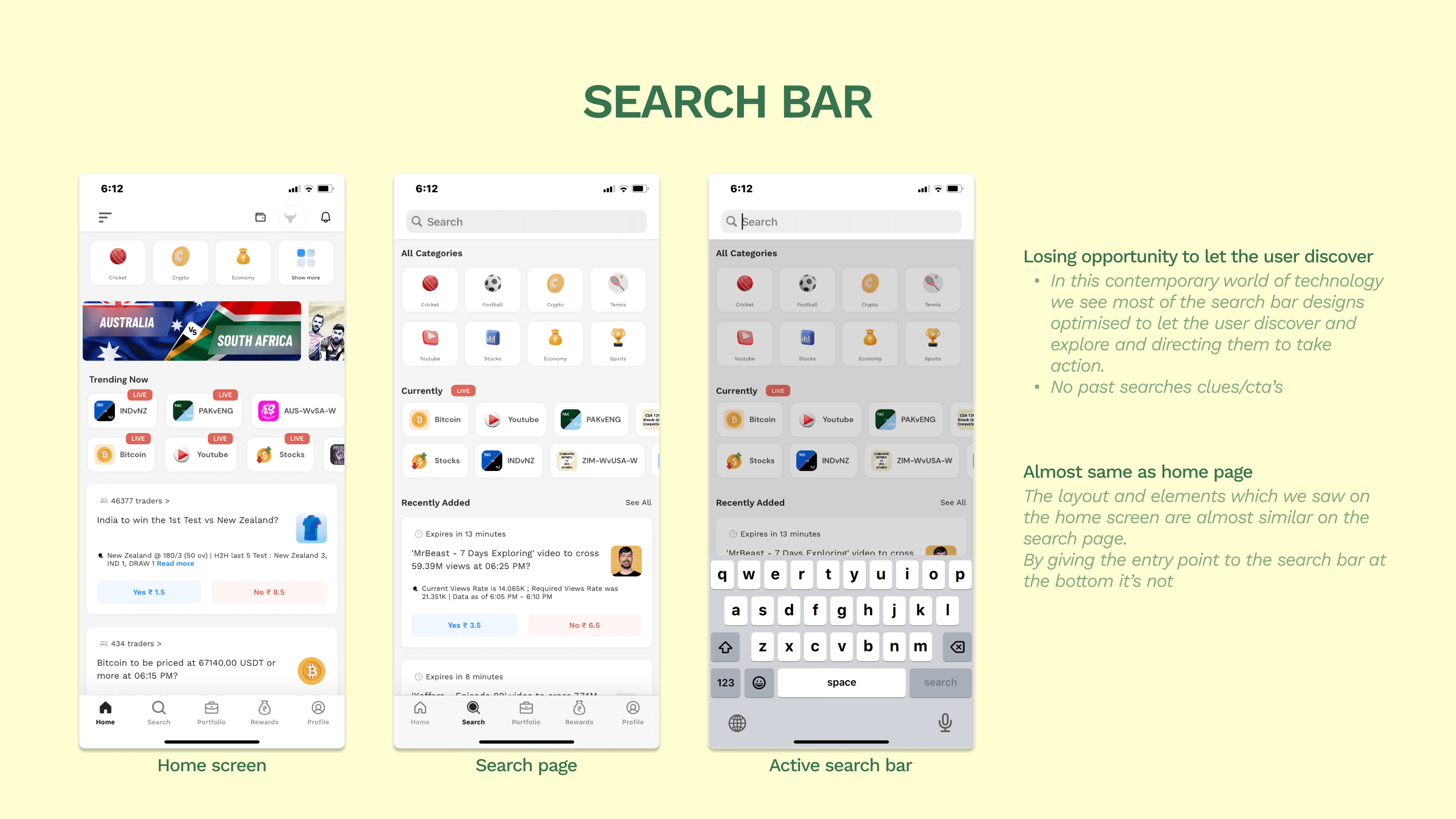
The search bar feels like an untapped resource.
The search bar is placed at the bottom, which is unconventional and might cause users to overlook it. Additionally, the search page layout closely resembles the home screen, losing an opportunity for the user to discover new content or actions.

examples of optimised search bars biasing users to take an action or discover more

Better copy to explain the referral program, I understand there's a video to explain but it takes effort to click on the video instead majority of the people would drop off if they didn't understand.
Back in 2012 I got lost in the ambience mall Gurgaon where none of the exits led back to the main entrance and it was a terrifying experience as a child, navigation is important.

It’s been a fun challenge diving into the app and uncovering areas where small changes could make a big impact. As someone who thrives on understanding user behavior and crafting experiences that truly resonate, I found this audit to be an exciting opportunity to explore how opinion trading can be made even more accessible and engaging for the Indian market.
I’d love to see how Probo continues to grow on its journey, and even more so, I would love to be a part of it.
As a UX researcher, I’m eager to collaborate with the design, data, and product teams to help shape Probo into India’s largest and most trusted information marketplace.
I would love to hop-onsite for an interview with the team, I really love the medium articles which you guys have put out very fascinating to see how you approach the problems.
Looking forward to hear back from you guys :) (contact links in the footer)